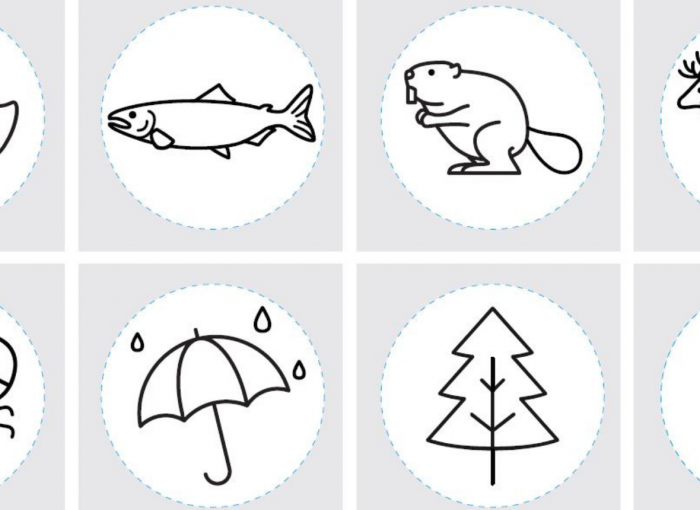
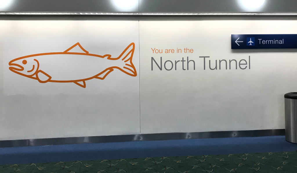
A Chinook salmon. A Douglas Fir tree. An open umbrella.
All the icons – eight in total – chosen for the new wayfinding signage in the Portland International Airport parking garages and tunnels embody the spirit of Oregon and the Pacific Northwest.
But initially, some of those images warranted considerable discussion.
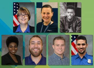
“Sasquatch was the No. 1 icon we discussed extensively,” said Irene Ng, senior manager of site and facility design at the Port of Portland, which operates PDX. “How do you make Sasquatch gender-neutral? Should we give Sasquatch eyes or a mouth? We talked a lot about how to make Sasquatch look like Sasquatch…but not a gendered Sasquatch.”
Sasquatch’s look was just one of the many choices carefully considered to ensure equity and inclusion were at the forefront of the airport’s new wayfinding plan.
For example, people for whom English is not their first language can follow signs that don’t rely solely on words and do incorporate simple, recognizable images. While the new signage does feature color, it also uses icons and words, so it’s useful for individuals who are colorblind. The elevators now have enhanced lighting, brighter colors and additional signage elements, making them easier to find for travelers who have mobility concerns as well as those who are just plain exhausted from a long flight.
Each of these features can stand on its own, but together they form a cohesive, equitable approach to wayfinding.
“My philosophy for all this decision-making has been ‘How can I make a positive passenger experience, regardless of demographic?’” said Ng.
Going with the plan
A comprehensive signage plan was discussed for years, and managing the plan became one of Ng’s first tasks when she joined the Port in 2017. The purpose of the plan was simple: Create a consistent wayfinding approach for travelers, from roadway to runway.
But a seemingly simple plan incorporates many details. Ng brought together numerous Port teams to create a set of wayfinding standards. This included Information Technology to guide the creation of digital wayfinding, Corporate Communications to help represent the Port brand, Landside Operations to handle roadway and parking garage signs, and Terminal Operations to manage signage needs inside the airport. She also coordinated with external signage consultants, contractors and designers.
PDX was already using universal icons such as a plane with its nose lifting off for departures and nose dipping down for arrivals, but more was needed to standardize across the airport as well as help travelers find their way with confidence.
“Wayfinding is like following breadcrumbs,” Ng explained. “For instance, when you get off a plane looking for the nearest restrooms, ideally there is a sign that tells you to turn right or left for them. You follow the signs until you see the restrooms. If the signs stop showing the restrooms, you know you’ve passed them, and you turn around.”
A new facility
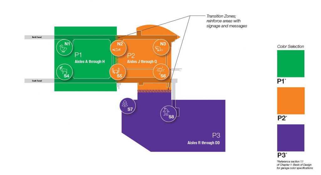
During the wayfinding planning process, the Port opened a new parking garage (P3) and rental car facility at PDX.
“When we kicked off this project, we wanted to think of the best way to bring people to and from the garage,” said Michael Huggins, senior manager of landside commercial at the Port. “We had an opportunity to look at the entire garage campus and make the best decisions to enhance the customer experience.”
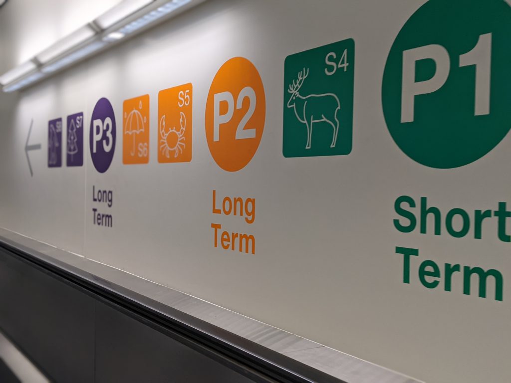
Prior to opening the newest parking garage, you could enter the short-term (P1) and long-term (P2) garages from either the north or south pedestrian tunnels, and each garage had its own color: the P1 garage was purple and the P2 garage was orange. But with the P3 garage and rental car center opening, the team needed to reinforce that the new facilities could only be accessed through the south tunnel. And, since the P3 garage now houses rental cars, the team also needed to find a color that didn’t evoke a rental car company’s brand.
The result: “You are in the north tunnel” and “You are in the south tunnel” messaging at the tunnel level, as well as rebranding the color designations for each garage to now be green for P1, orange for P2 and purple for P3.
Said Huggins, “With our comprehensive signage program, people can now find their way back and forth with ease.”
Into the tunnels
When travelers arrive at the airport, they’re more likely thinking of making it to their flight on time than categorizing where they parked. That’s why all the signage is oriented toward entering the terminal, and even the new icons are positioned toward PDX.
“We wanted to make it intuitive as you come out of the elevator. When you see the icons in the tunnel, the head is always pointing toward PDX,” Ng said. “In addition to the characters on the wall, there are also overhead signs, but when you get out of the elevator, it should be a single walk forward.”
Many people take a selfie to remember their parking spot, but getting to and from the area still needs to feel instinctive. For the wayfinding project, Ng said, the team thoroughly studied how people remember where they park.
“People lean toward characters, numbers and color,” she explained.
Elevators are now rebranded with N1, N2 or N3 for elevators along the north tunnel and S4, S5 and S6 for elevators along the south tunnel. The elevator walls are painted to match the parking garage color. Icons, as well as large graphics, adorn the wall to represent each elevator area.
The lighting of the signs themselves also played a crucial role. Over the years, signs were showing their age from repeated updates and application of new vinyl. Not all signs were ADA-compliant, and some weren’t as well-lit as others. But the new signs, Ng said, are consistently illuminated and legible for those with vision impairments.
Not all signs are created equal
“Unless you are making something simple like a stop sign or a speed limit sign, signage is a challenge,” said Eric Forsyth, engineering project manager at the Port. “It’s like social engineering: You’re constantly trying to put yourself in the position of the user.”
Not only do you have to get people where they need to go in a way that feels instinctive, there are seemingly limitless choices for signs, even with a well-developed master plan. Once a consensus is reached on variables including color, shape, size and position, manufacturing difficulties or inconsistencies still could occur.
In other words, it’s one thing to order a blue sign, and even if that specific color of blue is standardized, three signs made by three different manufacturers may come out looking three different ways. Sometimes multiple rounds of printing and fabrication are required to ensure tones match and that content and messaging are correct.
In addition to designing and manufacturing signs, installing signs is also a very detailed process – some of the overhead signs in the tunnels extend up to 17 feet long. To install them safely, the team first developed a structural design that accommodated the drywall of the ceiling and where utilities are run, along with ground penetrating radar (GPR) that indicates where in the concrete ceiling they can insert the structural braces that will hold up the sign.
Occasionally, surprises lurk, even with the most careful planning.
“Once you open up ceilings, you can find stuff you weren’t really expecting, and have to work together to develop a solution,” said Jeff Cheung, electrical project engineer at the Port.
Although the whole planning and installation process took weeks, the hanging process itself only lasts about an hour, explained Cory Coleman, Port construction contract manager.
“These are very large signs, so we coordinated with Airport Operations and Safety to determine if we would need to shut down the tunnel. We learned we didn’t need to, as long as we maintained a pedestrian pathway,” Coleman said. “This helped because we needed to maintain minimal disruption to travelers going in and out of the tunnel.”
Big projects like this happen at off-peak hours, and sign hanging is no different. It took place between 10 p.m. and 4 a.m., Coleman added.
An outside perspective
René Christianson, President & CEO at High Point Construction Services, a small, woman-owned company based in Portland, worked with the Port on the wayfinding project as a construction manager. High Point fabricated signage, painted, demolished and removed old signs and installed the new ones.
Christianson gave credit to her Port partners for their team-focused approach and professionalism. Throughout the project, the Port worked constantly with her and her subcontractors, going above and beyond to ensure they had everything they needed – even finding a convenient place for her painters to park so they didn’t have to make multiple trips to bring equipment from the opposite side of the garage.
“I really like and respect the people at the Port. They treat relationships from a team perspective, and that’s a great thing, because it means a better product for everyone. There’s a reason the Port of Portland operates the top-rated airport in the country: They put projects out for bids, get the right people on board and work together to get them completed successfully,” she said.
Moving forward, literally
“Overall, this has been a great project with a great team,” said Cheung. “Seeing the signs and graphics go up and watching how well everything came together is really rewarding.”
With the airport serving millions of travelers each year, making sure they have the best possible experience is crucial. Currently, the new signs can be seen on Concourse B and Concourse E with plans to expand their use throughout the terminal in 2022 and beyond.
“Driving in and out creates both your first and last impression of the airport, and we want to make it as easy as possible,” said Huggins. “We have a lot of business travelers who know their way around, as well as leisure travelers who are less familiar with the environment. Enhancing signage creates a better experience for everyone.”